People have been shocked to learn of a simple detail in the 7-Eleven logo they never noticed before.
Logos are everywhere. They are part of the modern world and as I'm sure you know, are used by businesses to quickly tell customers who they are.
Some of them are simple, others more complex but after time, their consumers begin to recognize them.
Advert
With that being said, as consumers we eventually stop noticing the details and just see the word or symbol and equate it to the business without thinking about it much more.
But one social media user has highlighted the tiniest detail in the 7-Eleven logo that you probably haven’t noticed.
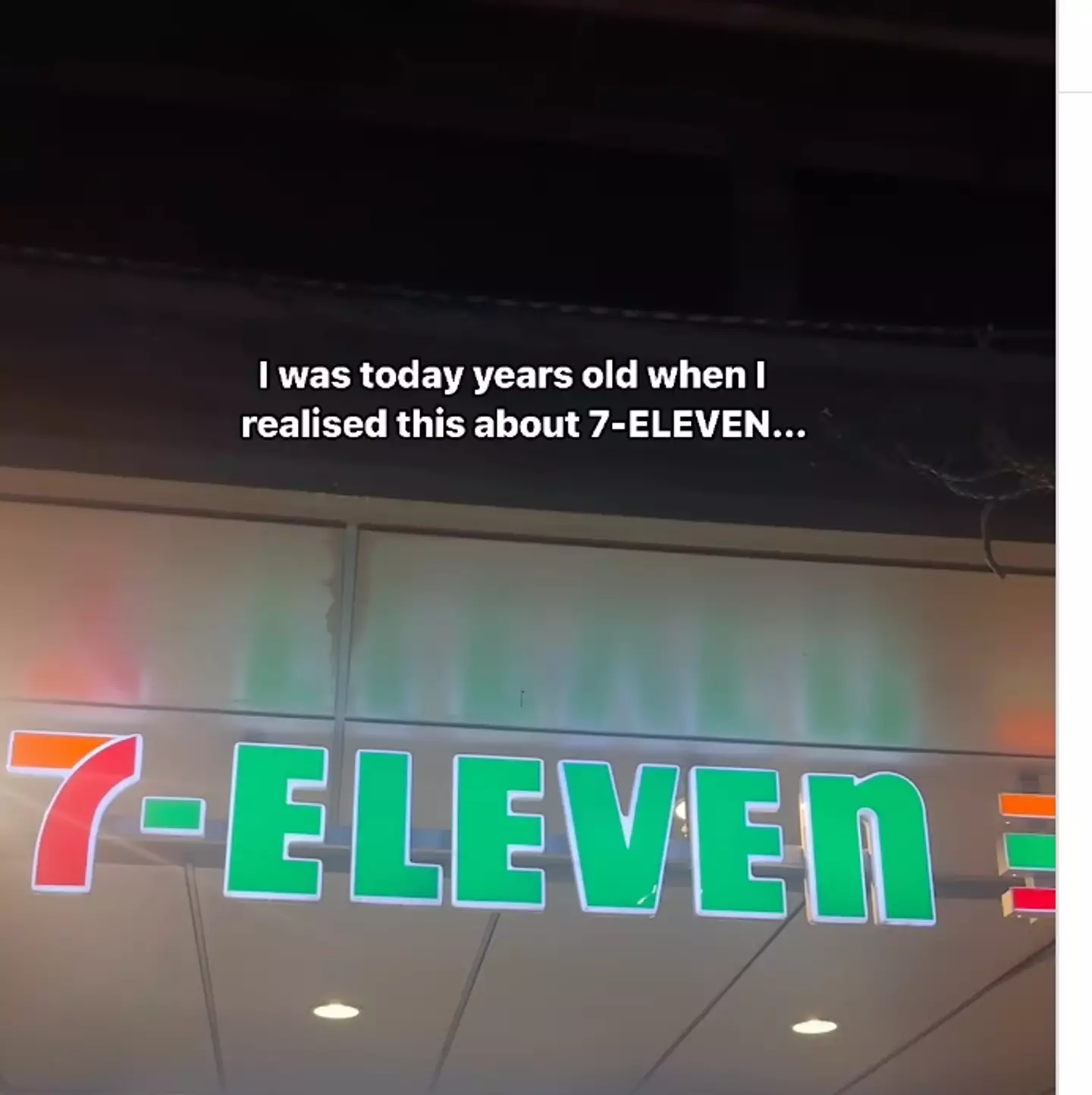
Have a look at it right now, can you spot anything about it that shouldn’t be there or stands out?
Advert
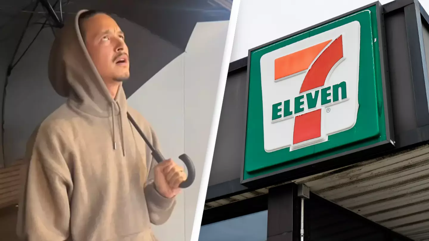
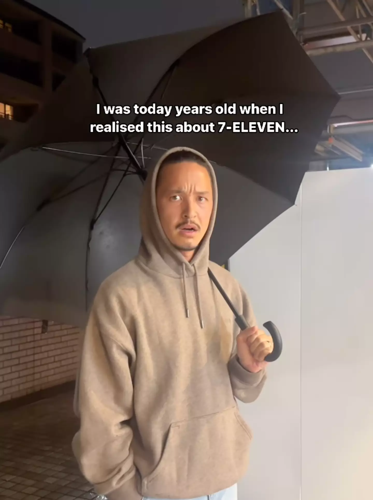
The eagle eyed Instagram user, @twosometravellers, posted a video on his page in late April and the clip has gone viral with over 150,000 views.
Many viewers remarking that they never noticed this small detail.
The man started the video by standing outside the convenience store chain and looking up at the sign, confused. He then switched the camera to show the outside of the store and the sign.
He then pointed out that the majority of the 7-ELEVEn sign is in capitals apart from the ‘n’ at the end which is lowercase.
The poster captioned the video: “How did we miss this? But why though?! Has it always been small? Was it ever big?
Advert
“What else are we not realising? What game are they playing? We have so many questions!!!!”
The brand account even clarified why this was, as people remarked they couldn’t believe they never noticed the grammatical error.
The brand account commented: “Legend has it, the original owner’s wife thought the logo looked more graceful with the lowercase ‘n’ as opposed to the harsher edges of the uppercase.”
And incase you were wondering, this wasn’t a recent choice, it has been this way since 1968.
“Hahahaha it kind of hurts my heart to see incorrect grammar… I can’t unsee it now,” one Instagram user noted.
Advert
“I was today years old when I learned this... Thank you for sharing such knowledge, I will forever remember this moment now if you will excuse me. IMMA GO SEE IF OUR 7-ELEVEn is the same!!!,” joked another.
“Honestly, after seeing your content I just realized it too and started to google the logo 😂 Apparently, it is true, the n is small capital,” a third wrote.
Amazing the things you don’t notice until someone points it out to you.
Topics: Community, Business, Social Media, Instagram, Weird